Showing posts with label Grace Anderson. Show all posts

Fernanda Ly: The Girl with the Pink Hair

Fernanda Ly: The Girl with the Pink Hair

Photo Source: x
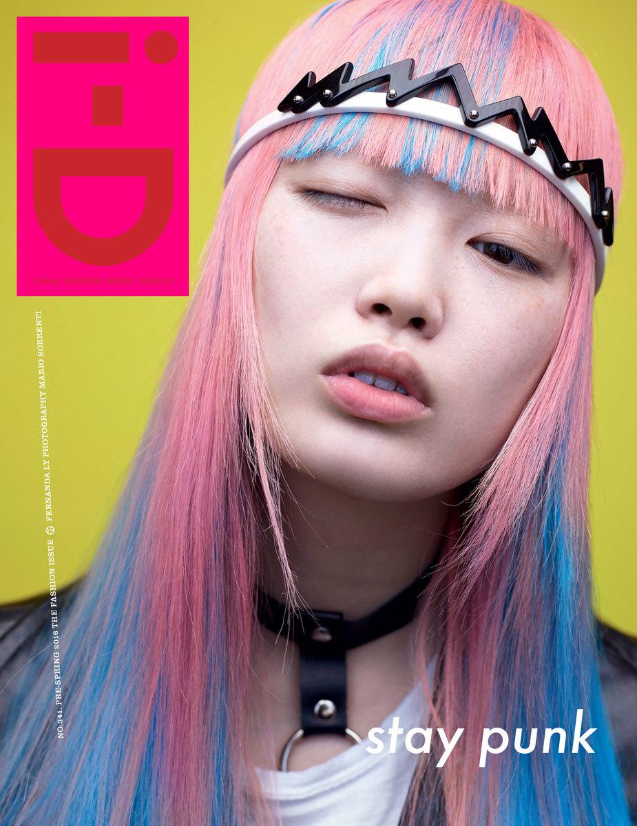
Fernanda Hin Lin Ly, the Aussie model with hair reminiscent of Pepto Bismol, came into the spotlight after Louis Vuitton's creative director Nicolas Ghesquière kept her off limits to other designers for two seasons. Her iconic appearance at his AW16 and SS16 shows rocked the world and left us yearning for her flawless Sailor Moon aesthetics. Since the LV shows, Fernanda Ly has graced the covers of four Vogue magazines, an i-D magazine, and most recently, the cover of CR Fashion Book.
There is important cultural significance to the rise of Ly's popularity as well. According to Teen Vogue, "All of Australia’s most notable models — including Elle Macpherson, Miranda Kerr, and Gemma Ward — are white. This is curious given that plenty of nonwhites call Australia home." In fact, Ly, whose parents are Chinese, grew up in a predominantly Asian neighborhood. Her rise this fashion month has marked her as the only nonwhite Australian model to make it big. And here's the thing: she didn't need the millions of followers, that perhaps Kendall and Gigi did, to rise up in the industry.
Vogue Japan cover by Ezra Petronio, Vogue Australia cover by Nicole Bentley
CR Fashion Book cover by Mario Sorrenti, Vogue China cover by Patrick Demarchelier
Vogue Italia cover by Mario Sorrenti and Craig McDean, i-D cover by Mario Sorrenti
At the age of 15, Ly attempted to go bleach blonde but, much to her dissatisfaction, the result was a coppery orange. It wasn't until two years later at the age of 17 that she would make the iconic switch to cotton candy pink.
Photo by Tommy Ton for Vogue
According to her interview with i-D magazine in February, her favorite modeling job so far hasn't been for top designers such as Louis Vuitton, for who she was a muse, but shooting with online retailer NastyGal. According to her, this favoritism was brought by NastyGal's generous supply of cookies on set.
Speaking of cookies, Ly's quirks don't end with her unusual pink 'do. She has an utter appreciation for the sweet things in life-- literally. She loves sweet treats, especially ice cream. Her instagram as well as her interviews reveal her obsession with scones, latte art, and other café desserts and sweets.
Right: Ly at Louis Vuitton FW15 show, Left: Ly's street style (photographed by Tommy Ton for Vogue)
In addition to her love of bakery treats, Ly is deeply fascinated with architecture. She was an architecture student at a university in Sydney until she took a leave of absence to pursue her career in modeling, but she does plan to go back to the field in the future. "Clothing and fashion, buildings and architecture, they come hand in hand," she said to CNN Style, and revealed architecture was a mutual interest between her and LV's Ghesquière. Her favorite structures include Notre Dame (which turned her onto architecture), St. Mary's Cathedral in Tokyo, Church of the Light also in Tokyo, the Morimoto Restaurant in New York City, Bridge of Aspiration in London, and the Optical Glass House in Japan. Her interview with CNN Style revealed her utter intelligence on the matter, and she spoke only with the utmost eloquence.
Photo Source: Ly's instagram @warukatta
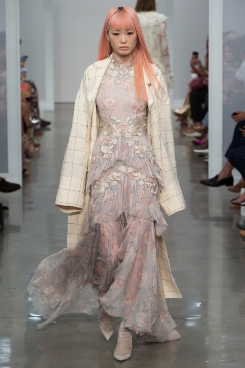
Fernanda Ly has walked a total of twenty-five shows as of the time this article is published. She's walked for Rihanna's recent Fenty x Puma show, as well as Dsquared, Dolce & Gabbana, Ermanno Scervino, Giamba, Max Mara, Fendi, Simone Rocha, Vera Wang, DKNY, Zimmermann, and --of course-- Louis Vuitton. According to Dazed, it's the “'vastly different cultures and people you are able to encounter while casually waiting for a casting' that Ly most enjoys about her work, a positive byproduct of the widening acceptance of both racial and stylistic difference supported by the industry’s biggest houses." 
She continues to dazzle us with her baby pink locks, confident walk, and intellectual insights. We can't wait to see and hear more of Fernanda Ly in the future.

Kendall Jenner: Not En Pointe

Kendall Jenner: Not En Pointe

Photos by Miguel Reveriego for Vogue Spain
Alas, we are never finished talking about Kendall Jenner.

The internet exploded this week with outrage from ballerinas and dancers around the world in response to Kendall Jenner's video shoot with Vogue Spain. In the video, Kendall is rather quirky as she dances (? we're not really sure what she's doing) and while narrating some inspirational sentiments, such as: "I've always been adventurous, so I love doing stuff like that-- I don't know, just stupid stuff. I love walking around; being able to be free."

Photo via Kendall's video shoot with Vogue Spain
What's the outrage? Kendall's odd ballet antics dumbfounded dancers, who then took to social media to voice their anger. The main complaint was that Jenner was appropriating ballet culture. Perhaps the most notable critique came from Dance Moms star Abby Lee Miller, who stated on Instagram, "...I cannot be a fan of this shoot. There are so many amazing dancers in the world… Kendall Jenner is not one of them! Shame on Momager, Kris Jenner!!!" Indeed, this Vogue shoot would have been a better opportunity to feature many amazing ballerinas who have years of expertise and hard work under their belt. At the very least, a model trained in ballet, such as Karlie Kloss, should have played the part. As Twitter user @ohsolucee stated, "Ballet dancers don't train 7+ hours a day, 7 days a week, to be represented by Kendall Jenner & her dodgy feet."
Kendall in her Vogue Spain video shoot
However, ballet appropriation is not the only controversial aspect of the video shoot. Ballerinas being portrayed by thin women is, for a large part, unrealistic. As Isha Aran of Fusion stated, "Both the fashion and dance worlds risk promoting harmful body image, so attempting to pass someone off as a ballerina on the sole merit of being skinny is not just reductive and insulting. It’s actively harmful." Professional ballerinas and dancers often have built, muscular frames and toned muscles. There has been, however, extreme pressure in the ballet industry for dancers to be very slight and thin, prompting a campaign in 2014 called "Take Back the Tutu." The campaign aimed to combat pressures ballerinas face, such as body image, eating disorders, and beauty.

Proper ballet form, via Misty Copeland (@mistyonpointe)
A few weeks ago, I discussed other issues I have with Kendall in the industry and how her success is mainly due to nepotism. More eyes were opened after Jenner's video shoot with Vogue Spain, and she has now been bombarded with claims of appropriating ballet culture. It's important to recognize that Jenner, along with her Kardashian sisters, have been appropriating black culture for years. Just over a week ago, Kendall walked down the runway of Marc Jacob's SS17 show wearing dreads (you can see them here) and then showed them off later on her Instagram. However, the outrage that was sparked from this was little in comparison to the response to her Vogue Spain video. Perhaps it's not only time to question Kendall's presence in the industry, but our response to different levels of appropriation as well.

The NYFW Color Palette

The NYFW Color Palette

Atmosphere at Altuzarra SS17. Photo via Vogue Runway. Edit by author.
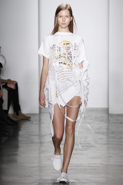
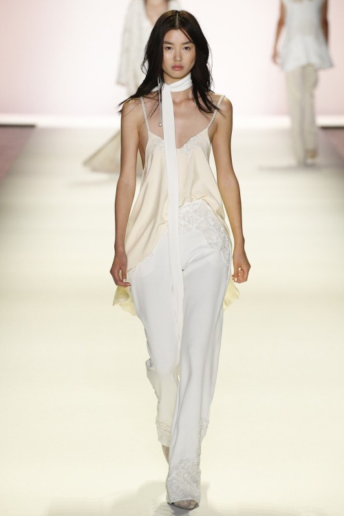
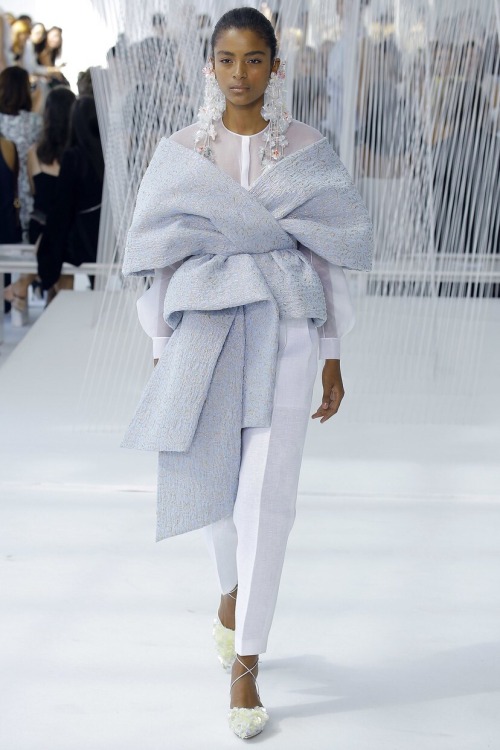
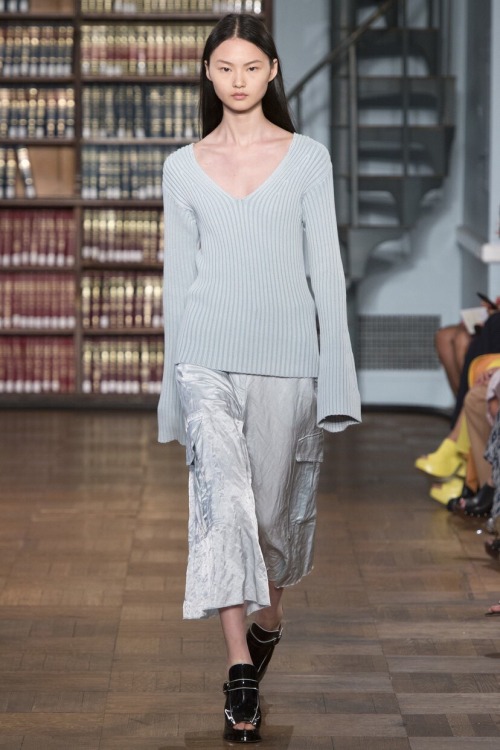
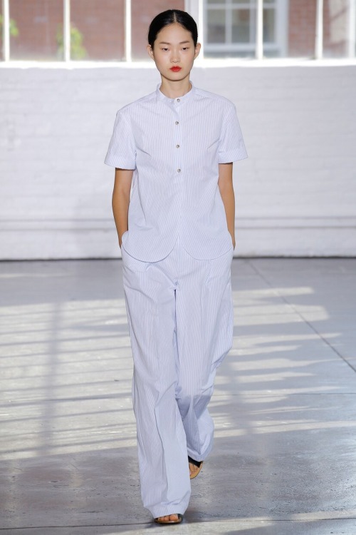
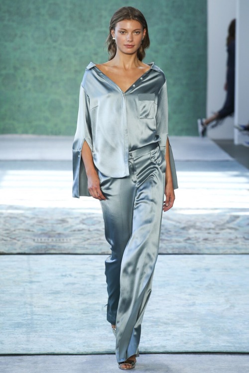
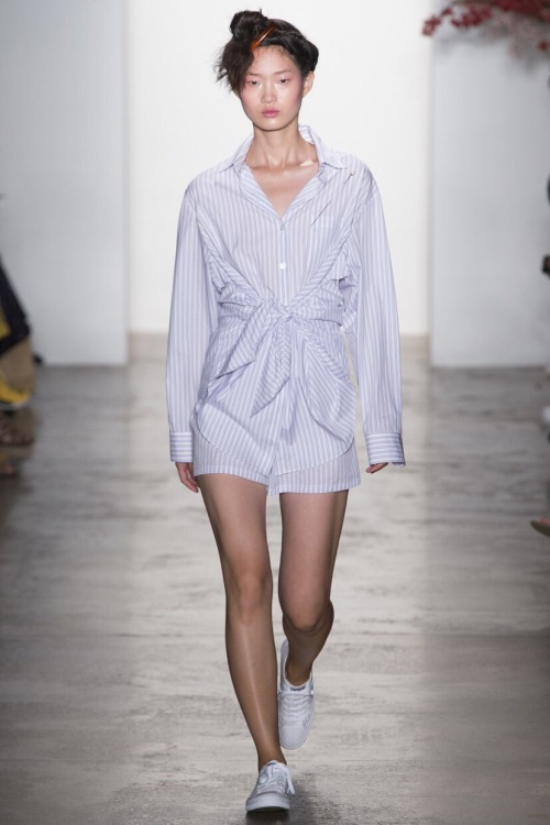
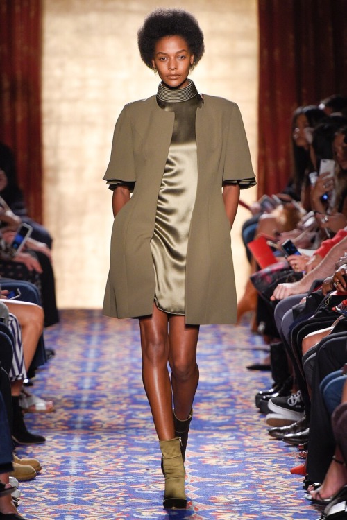
New York Fashion Week wrapped up this past Thursday, and its shows were unique, artistic, and—as always—very entertaining. One cannot help but notice the recurring color palette in each show, so let’s take a look at this season’s colors of choice and dive into their significance in the industry.
Photos via Vogue Runway
Whites and Creams: Complete. Pure. The color of perfection. Purity. Wholeness. Innocence. Completion. Neutrality. White awakens openness, growth, and creativity as the color is completely reflective. According to Empower Yourself with Color Psychology, “Many people use white as a recall of their youth and innocence. It reminds them of a time when their lives were easier and less complicated.” We cannot help but agree as this season’s displays the color in youthful styles. White also represents new beginnings; perhaps its use this season marks a shift in trends and changes in the fashion industry.
 
Photos via Vogue Runway
Pastel Blue: Serenity. Calm. Spirituality. “Psychologically associated with air, lighter blues have a calming effect,” according to Color Wheel Artist. The use of pastel blues this season indicated cleanliness and mimicked the feeling of fresh air. In a world as chaotic as it is today, such a breath of fresh air is very much needed.
Photos via Vogue Runway
Olive: Space. Wisdom. Peace. Compassion. Hope. As stated by Vibrational Energy Medicine, the color olive is “the feminine archetype of compassion, wisdom, acceptance and understanding and modeling it to others.” For women’s ready-to-wear shows, olive green in a collection seeks to empower women and represent their strength.
Photos via Vogue Runway
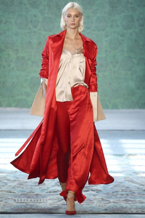
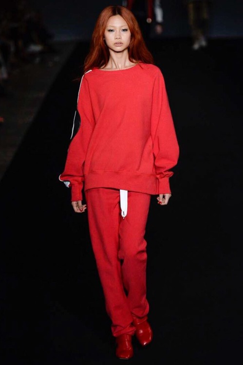
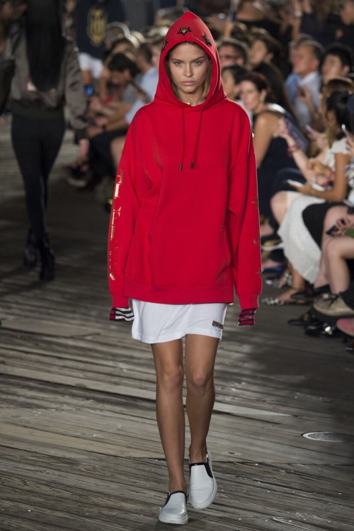
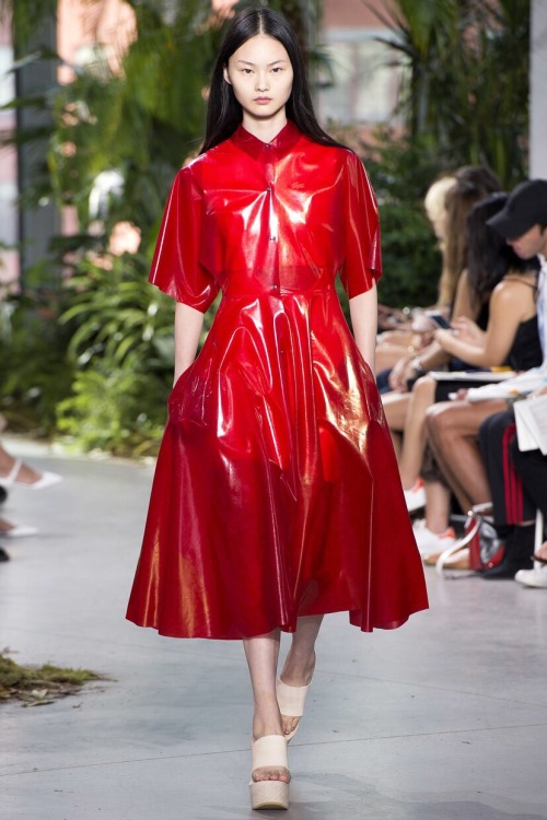
Bright Red: Energy. War. Danger. Strength. Power. Determination. Passion. Desire. Love. As an emotionally intense color, red is used to indicate courage as well as danger. Along with olive green, red gives the impression of female empowerment and strength. Bringing red into a collection grabs the audience’s attention, and creates a sense of dominance.

Yeezy Designer Makes Trash Chic

Yeezy Designer Makes Trash Chic

Photo via Tumblr, edit by author, Preston on left and West on right
Zoolander will come to life in Heron Preston's NYFW show.

The character of Mugatu, played by Will Ferrell, in the aforementioned film created a collection he termed "derelicte." He describes the concept as "a fashion, a way of life inspired by the very homeless, the vagrants, the crack whores that make this wonderful city so unique."


Mugatu creating the "derelicte" look, photo via Twitter
At least, the New York Post will have you believe Preston is creating a derelicte show, as their headline proudly declares: "Fashion Week Designer Decides Dumpster-Chic is a Good Idea."

However, this is not the full story. Preston, celebrated for his collaborations with Kanye West and Nike, is using this upcoming collection to support New York's Department of Sanitation (DSNY)'s efforts to reduce landfill waste. See Preston's full explanation in his Instagram post below.

Between 1624 - 1798, New York City never gave any real attention to waste management. Streets were literally covered in dirt, mounds of manure, rotting animal carcasses and raw sewage. New Yorkers were literally poisoning the very city they lived in. Eventually a highly contagious yellow fever epidemic swept the city. People were putting their sick loved ones in the gutters to die in fear they would catch it too! The city's horror was the motivator to clean up realizing health and cleanliness were linked. The DSNY "caduceus" trademarked logo is a reflection of that time and why they decided to identify with it. Most of us however recognize this symbol from the medical industry where it is mainly used. This also explains why the DSNY is located in the NYC DEPT OF HEALTH building at 125 Worth St. 📸 @alifeinadiary #hpc0x30 #dsny #uniform #workwear
A photo posted by HPC TRADING CO (@heronpreston) on
Photo via @heronpreston on Instagram
Heron Preston, according to a DSNY spokesman, was inspired to create an eco-friendly collection earlier this summer when swimming in the Mediterranean and getting tangled in a garbage bag.
Preston's ready-to-wear collection will be composed of repurposed DSNY uniforms (as the show itself is adequately titled "Uniform"), to bring well deserved recognition to hard working DSNY employees. These employees serve as many as 8.5 million people in New York City. Extending this recognition, Preston's show will be held at a city-owned facility, DSNY's Spring Street Salt Shed, that is usually off-limits to the public.

Photo via @heronpreston on Instagram
As for the collection itself, Preston is recycling old DSNY employee uniforms. From the uniforms, Preston will create looks using patches of the neon green and orange uniforms next to screen-printed graphics, as is his typical fashion.

Photo via @heronpreston on Instagram
Want to attend the event? According to Complex, "25 tickets to the event will be sold for the hefty price of $2,030 each. Rest assured that money will go to a good place, though. DSNY will put the money towards a foundation for New York's garbage workers and an 'educational museum' full of artifacts and old equipment that goes all the way back to the 1800s." If you're looking to purchase, Preston's publicist states that "The unisex gear will be available online and in pop-up stores." You can find Preston's store here.

Styling the Seventies

Styling the Seventies

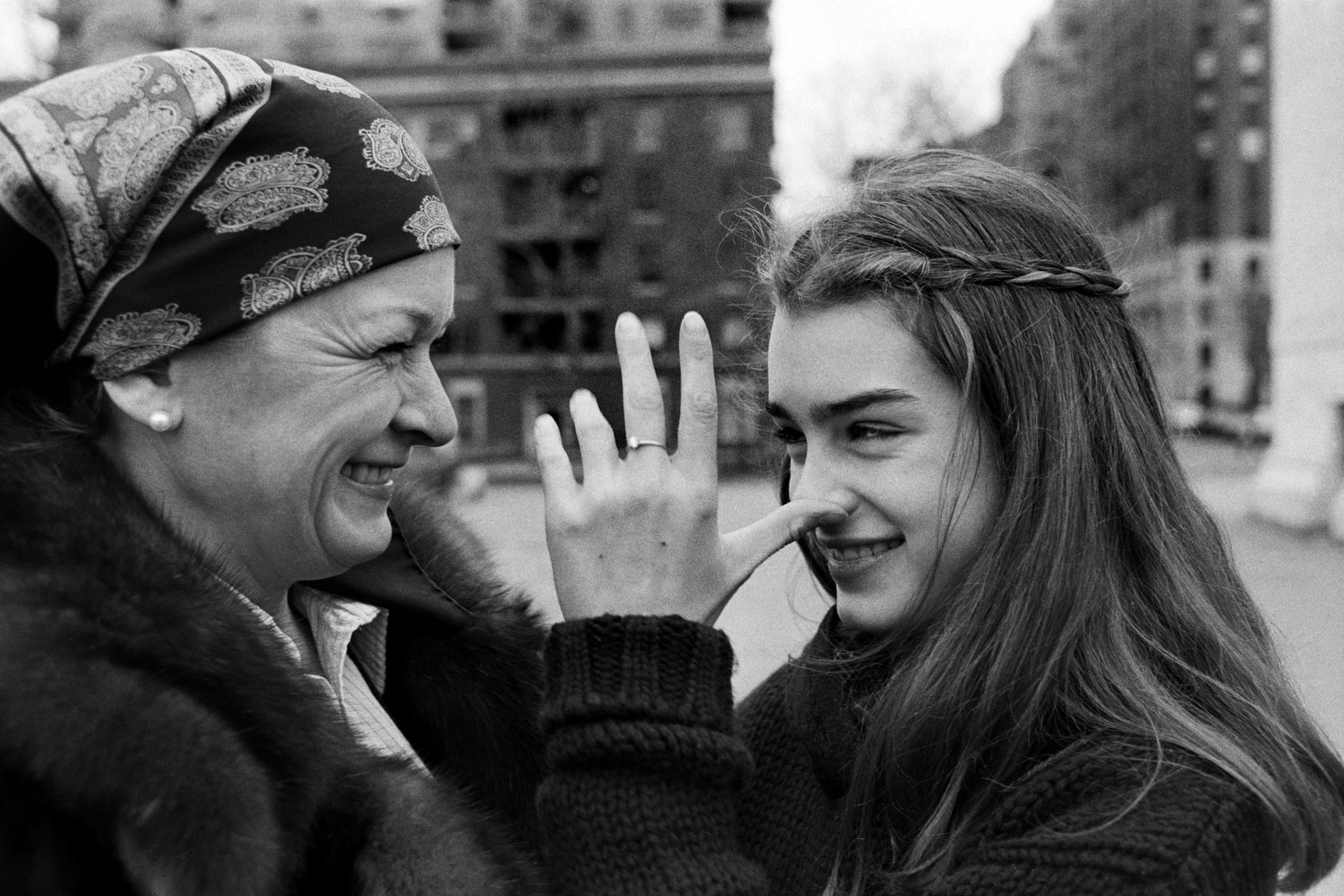
Brooke Shields, circa 1978
I'd like to open with this picture of Brooke Shields, taken around the time Pretty Baby was released in 1978, and as Shields was likely starting to film The Blue Lagoon. This is a picture I hold near and dear to me, and I can't quite explain why I find it so comforting or aesthetically pleasing. Perhaps it's Brooke's bushy brows, or maybe her joyful smile-- or, perhaps, it's the braid that resembles a crown only a goddess could wear... Either way, Brooke was on the brink of something big in the 70s. Her career was just beginning, and her iconic Calvin Klein ad was only a year or so away. 

Let's take a look at some of the other most iconic looks from 1970s, which, as you may have noticed, are making a large comeback. Take a look at the Urban Outfitter's catalog, or Topshop Unique's Fall 2016 Ready-To-Wear collection, and you will undoubtedly see the startling pattern. Styling looks from the 70s may seem daunting, but the first step is realizing how icons pulled it off forty years ago.

     
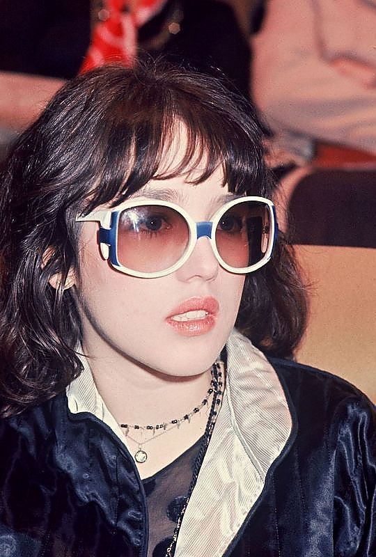
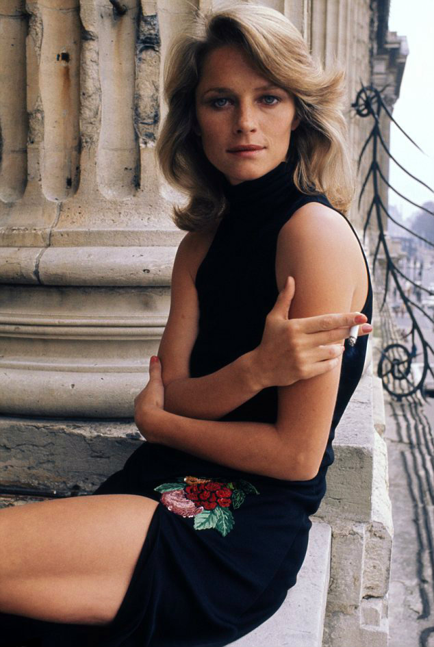
Isabelle Adjani, 1975 and Charlotte Rampling in Paris, 1974
Big glasses and big lips are no new trend. Contrary to what Tumblr might have you believe, many of today's aesthetics are not new or innovative; rather, they are captured from the past. Iconic snapshots of celebrities and models posing with cigarettes caught between their fingertips were the object of the camera forty-two years ago too.
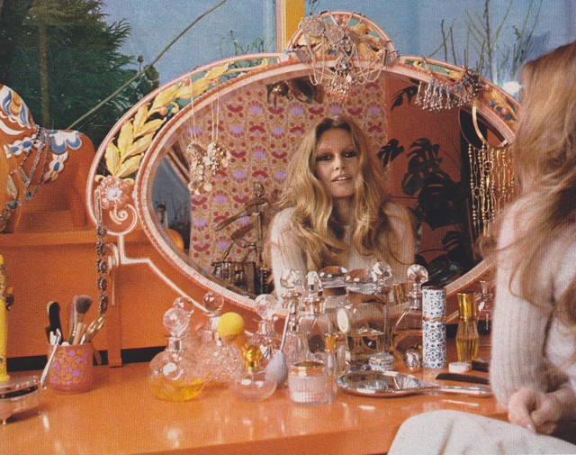
Brigitte Bardot, 1973
Bardot, arguably one of the most famous sex symbols of the 50s and 60s, retired from the entertainment industry in 1973. However, post-retirement B.B. would go on to pose for Playboy Magazine and become the muse for sculptor Miroslav Brozek. Around forty years old at the time, Brigitte Bardot found her freedom in the 1970s.
Carine Roitfeld, mid-1970s
There are many places you may have heard of Carine-- she was the former editor-in-chief of Vogue Paris, was the subject of the excellent documentary Mademoiselle C, and is currently the global fashion director of Harper's Bazaar and runs her own magazine, CR Fashion Book. However, many avid fashion readers aren't aware that Roitfeld had a brief modeling career in the 70s. It was also the decade she met her partner whom she would later have two children with, never marry, but is still with to this day.
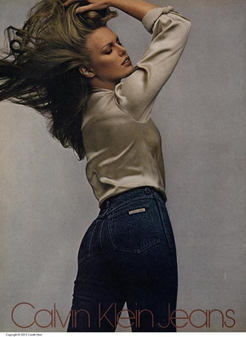
Calvin Klein Ad, 1979
Believe it or not, there were Calvin Klein ads before Brooke. Of course, the jeans were high-waisted and have the "mom jean" flare. Easy to style, these jeans can be pulled off just as you see in the decades-old ads. Tuck in an oversized shirt, allow your jeans to cinch your waist...

And strike your best Brooke Shields pose.

Pretty in Pink

Pretty in Pink

Photo via Drake's instagram (@champagnepapi), author's edit
Call it what you want. The trend has been dubbed everything from "not-pink pink," to "Tumblr pink," to "Laduree-macaron-pink." The powder pink color has been spreading across the fashion industry like wildfire. Not only is it a trend in womenswear, but men are pulling it off too (please see Drizzy above). Pink has always been a controversial color in the menswear market as it has been seen as a traditionally feminine color. But as our society grows and changes, we have realized that perhaps gender doesn't have color. The color discrimination, otherwise known as Blue vs. Pink, between the sexes is still apparent in our culture today-- just walk into any convenience store and you'll notice the difference in branding for men's and women's hygiene products, for example. In fact, gender discrimination through such branding has been adequately labeled as the "Pink Tax," i.e. women have to pay more for the same product as men because the product is marketed toward them.

Photo via Just Jared
However, as the pink (or whatever you want to call it) trend spreads at a rapid pace, men and women alike are embracing the color as a neutral one. In fact, the color has become so on trend among the general population that Pantone announced Rose Quartz as one of the two colors of 2016. As Laurie Pressman, VP of Pantone Color Institute stated, "Rose Quartz is about the rosy glow that comes along with good health. [It's] also connected to this gender blurring we've been seeing over the last five years. Pink is no longer just for girls and blue for boys." 

Photo Source: X
While Pantone's Color of the Year decision arguably has significant cultural influence, the powder pink trend can be seen on the runway since the Fall/Winter shows of 2013 (seen above) and has continued to blossom ever since. Celebrities such as Kim Kardashian and Rihanna have sported trendy pink apparel for many years; the picture of her above was taken in 2014, though she continues to display the trend today.

Photo via Tumblr user colemarryme
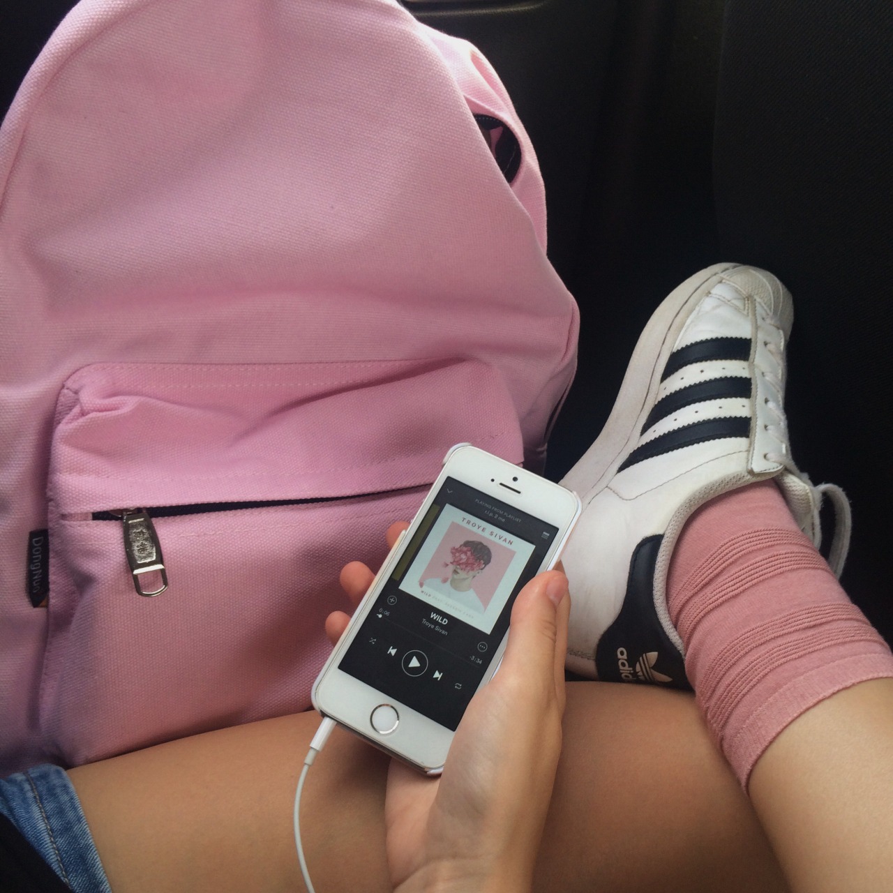
It's become "aesthetic," in the words of many Tumblr users. Branding in a non-gender discriminatory way has become overwhelmingly popular with the use of this color-- we recommend checking out an MTV writer's tweet on the subject. It's Acne Studios' signature color, as well as that of Thinx ads and Glossier campaigns. Pink, perhaps, isn't what it used to be. The fact it's resurfacing in a non-bright and thus non-obnoxious form, pink is more sophisticated than ever. It's minimalist. It's chic. It's pink, no gender attached.

Instagram